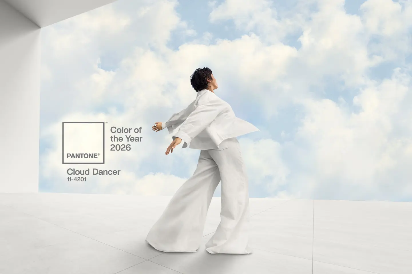
Fez – Pantone has chosen a billowy off-white called “Cloud Dancer” as its Color of the Year for 2026, marking the first time the company has named a shade of white since it began the annual selection in 1999.
Described as a “balanced” and “aerated” white, PANTONE 11-4201 “Cloud Dancer” is meant to act as a visual pause — a calm, almost weightless presence in what the brand calls an increasingly noisy world.
A first time for white
For over two decades, Pantone’s Color of the Year has usually been a statement hue: bold corals, deep blues, soft peaches, earthy browns. White — until now — never made the cut.
‘Cloud Dancer’ changes that. The tone is not a stark, clinical white, but a softened, cloud-like variant designed to feel gentle rather than cold. Pantone positions it as a response to a collective desire for quiet and clarity after years marked by tension, uncertainty, and information overload.
The company compares the shade to a blank canvas, suggesting a fresh start and a chance to strip away outdated habits and ideas. In that sense, ‘Cloud Dancer’ is less about decoration and more about resetting the frame.
Calm, clarity, and a blank canvas
In its announcement, Pantone links “Cloud Dancer” to serenity and focus. The shade is presented as a conscious move toward simplification — a color that steps back so that people, objects, and ideas can step forward.
The logic is psychological as much as visual. In a time that the brand characterizes as “frenetic,” this white is supposed to soften the visual field and help people tune out some of the constant noise. The idea is that a neutral, open space can make it easier to hear one’s own thoughts and to reconnect with others.
‘Cloud Dancer’ also carries a symbolic weight. As a near-blank tone, it suggests the possibility of a clean slate and a new chapter, whether in personal life, design, or social conversations.
How Pantone reads the mood
Pantone’s Color of the Year is selected by the Pantone Color Institute, a group of researchers who track how color appears and evolves across multiple fields — fashion, product design, interiors, technology, art, and even travel.
Throughout the year, they scan new collections, cultural shifts, and global headlines to understand which color families people are gravitating toward and why. The chosen shade is then presented as a kind of visual summary of the moment, a bridge between cultural mood and design language.
‘Cloud Dancer’ is the latest step in a recent run of softer, comforting tones. “Mocha Mousse,” the 2025 color, was introduced as a warm, grounding brown. “Peach Fuzz,” selected for 2024, was framed as a gentle, nurturing shade of peach with a focus on human connection. ‘Cloud Dancer’ pushes that soothing register even further, stripping away almost all color and leaving a luminous neutral in its place.
From trend to everyday life
Pantone’s annual choice tends to ripple through multiple industries. Fashion houses, cosmetics brands, interior designers, and product teams often pick up the shade or its relatives, whether in statement pieces or subtle accents.
With Cloud Dancer, the impact is likely to be more structural than loud. Rather than one standout item in white, the shade may appear as a base for collections: walls, fabrics, packaging, digital interfaces, tableware. Its softness makes it an easy partner for bolder colors and natural materials like wood, stone, and metal.
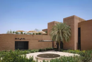
For designers in regions like Morocco and the wider Mediterranean, a shade like “Cloud Dancer” also sits naturally alongside existing palettes — whitewashed surfaces, sun-bleached stone, and the play of light in coastal architecture. It can frame traditional patterns and rich pigments without competing with them.
A quiet statement for a turbulent time
Cloud Dancer may look modest at first glance, especially compared to past electric blues or saturated corals. But Pantone’s bet for 2026 is that this restraint is precisely the point. In a period marked by loud rhetoric and rapid change, the most radical gesture, the institute suggests, might be to clear space.
By choosing a white for the first time in its history, Pantone turns absence into a statement: a call for pause, for rethinking, and for starting again with a surface that is, at least symbolically, clean.